Financial Services
Orizal Financial Advisors
2021-Present
Case study3 Dental
A new clinic began receiving website enquiries in its first week by making dental care easier to understand and approach.
FableForce

A solo dentist was opening his first practice without reviews, reputation, or word-of-mouth. Before patients could choose the clinic, they needed to understand what would happen when they arrived and feel comfortable taking the next step.
3 Dental was opening its first clinic in Tampines. It had no reviews, established reputation, or word-of-mouth to reassure someone considering an appointment.
That absence matters in dentistry. Patients are not only comparing services. They may be worried about pain, cost, unfamiliar procedures, or what will happen once they sit in the chair.
Most dental websites do little to reduce that uncertainty. They begin with credentials, equipment, and clinical terminology. But someone searching with a toothache late at night is rarely thinking like a dental professional.
The opportunity was to begin with the questions patients were already asking.
What is wrong? What will happen? Will it hurt? Can I trust the person treating me?
Trust could not depend on claims alone. Patients needed to see and understand enough of the experience to feel comfortable taking the next step.
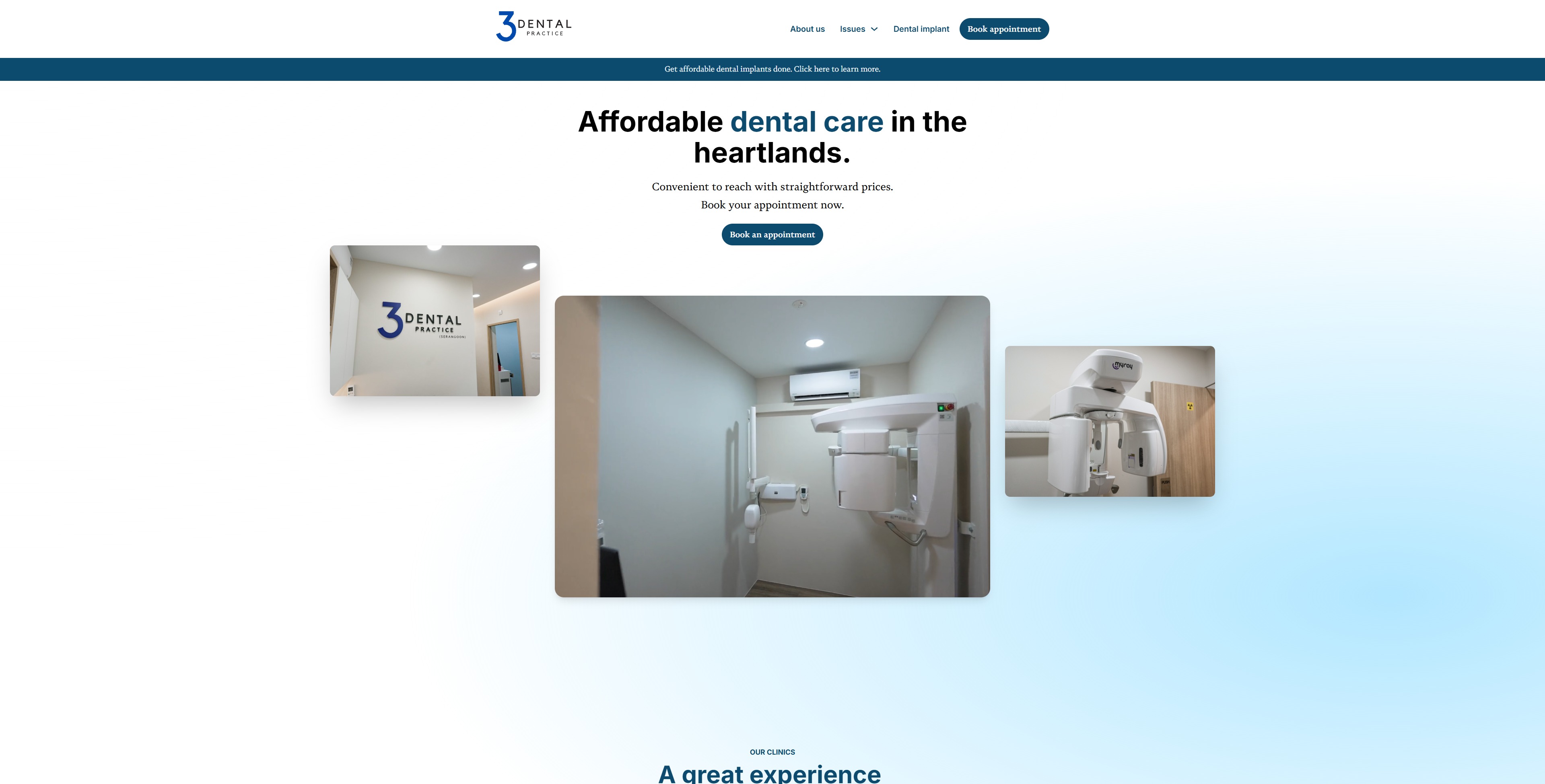
We filmed and photographed the real Tampines clinic, including its rooms, chairs, equipment, and team. Instead of asking visitors to imagine the experience through stock imagery, the website allowed them to become familiar with the clinic before arriving.
The same principle shaped the writing.
“Endodontic treatment” became “Fix my toothache.” “Periodontal scaling” became “deep cleaning of infected, swollen, bleeding gums.”
The clinical accuracy remained. What changed was the point of entry. Each service began with the problem as the patient understood it, then explained the relevant care in clear, everyday language.
The visual tone, language, navigation, and booking path worked as one experience: make treatment easier to understand, the clinic easier to trust, and the next step easier to choose.
Website
Homepage reassurance
Most dental websites are organised around professional terminology. The language may be precise, but it asks an anxious patient to diagnose and translate their own problem before they can find the right care.
We organised 3 Dental around the reasons people actually seek treatment: pain, straightening, missing teeth, or a general check-up.
Someone with a toothache did not need to know which branch of dentistry to search for. Someone considering clear aligners could see the treatment process, weigh the advantages and disadvantages, and find answers to common questions before booking.
The website was not designed to simplify dentistry. It was designed to make dental expertise easier for patients to navigate.
That distinction carried through to the booking moment. After helping visitors recognise their problem, understand the treatment, and become familiar with the clinic, the website made the next step direct and visible.
The website began generating patient enquiries in its first week.
Some patients discovered 3 Dental online. Others encountered the clinic through offline channels, then used the website to understand its services and decide whether to act. In both journeys, the website gave a new practice a clear, reassuring place to convert interest into an enquiry.
More than two years after launch, the patient-first language and navigation remained in use. The practice has since expanded beyond Tampines with a second location in Serangoon.
The growth belongs to the team behind 3 Dental. Our contribution was to give a new clinic, without an existing reputation to rely on, a website that helped patients understand the practice, trust what they saw, and take the next step from its first week.